

Nosferatu, a Symphony of Horror
This is a special one. Murnau's Nosferatu is easily the film I've watched the most and my entry to German Expressionism (probably the single most important influence source in my work).
I have to admit this is not the first time I attempted making a poster of it but I was never happy with the result before. In those posters, I always felt what I had left out was more important than what I was managing to reflect in them.
UFA (the German studio where Nosferatu was made) got illustrators to develop their movie posters as lithographs that were incredibly conceptual and always very impactful and that is what I wanted to achieve myself.
So I decided to approach this poster design in a completely different way. I started selecting the scenes that I thought captured the film best and started painting them on the iPad. The idea wasn't to make any of those images the final one but getting immersed in the narrative once more.
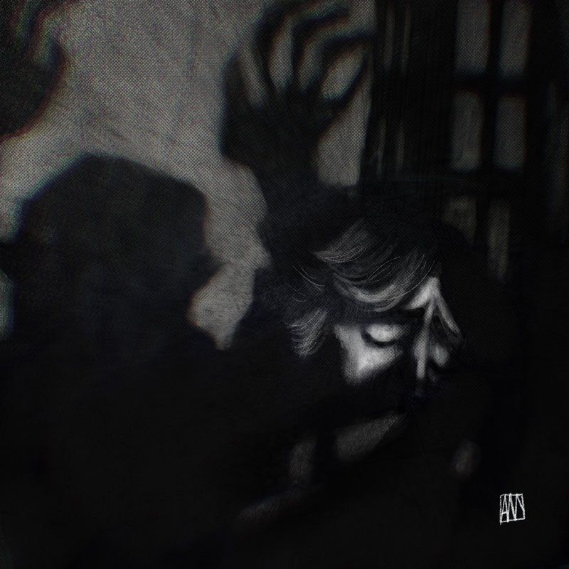
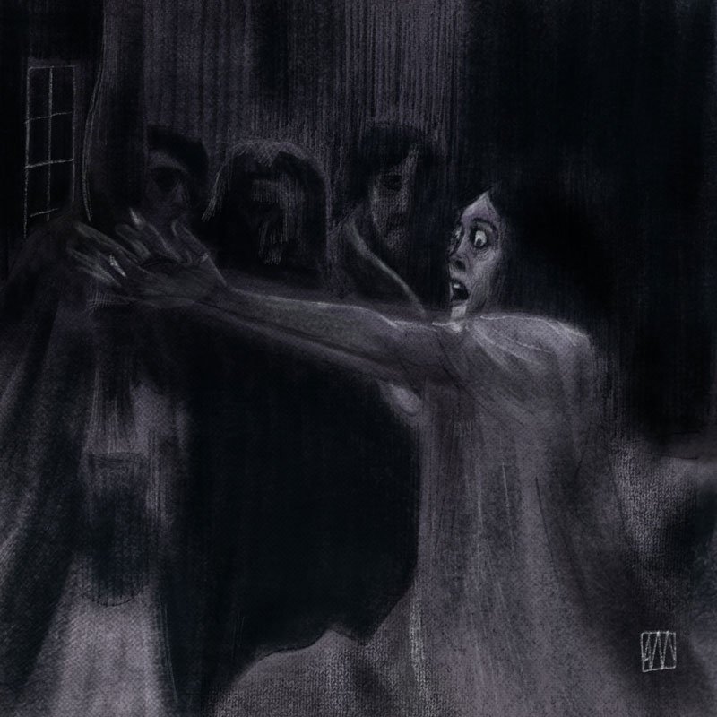
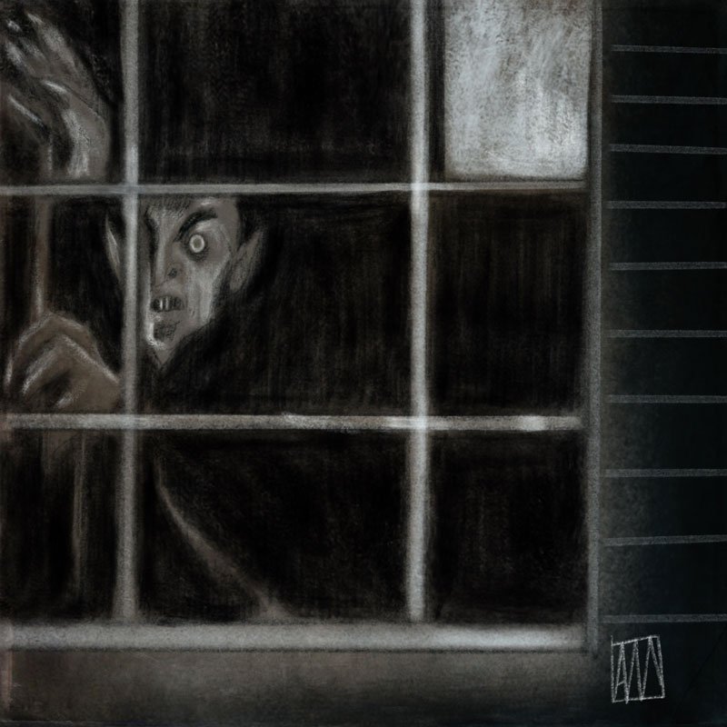
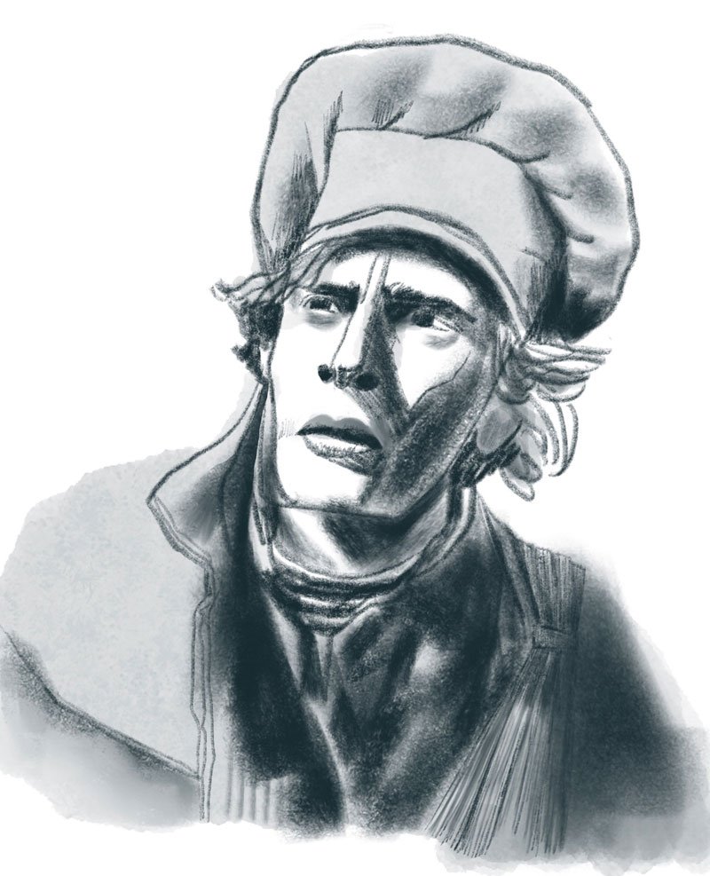
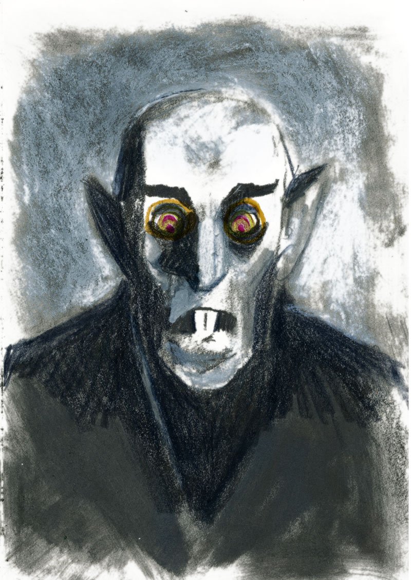
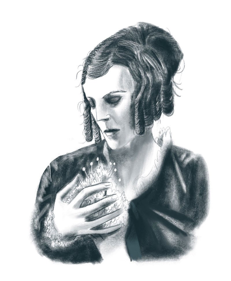
Once I had worked in the scenes, I tried to work on the characters. I wanted to include everything each one of them portray in the film in only one image.
Again, this was an exercise in understanding the characters rather than an approach to the final image.
And then I felt I was ready to tackle the movie poster itself.
I started developing pencils and arranging elements on a central composition. The poster was looking good but as I started coloring it, I felt it was getting busier and busier: London, the Carpathian Mountains, the Demeter, all the main characters... I was trying again to put everything I like in the movie instead of doing what a poster must do: create impact and interest in the movie.
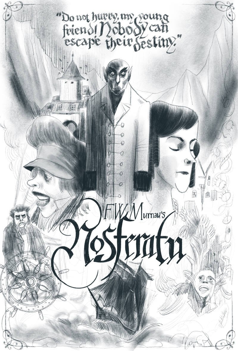
This Nosferatu poster was getting close to not being made at all (again). Taking a step back, it looked to me like the kind of poster someone who would know nothing about the movie would do.
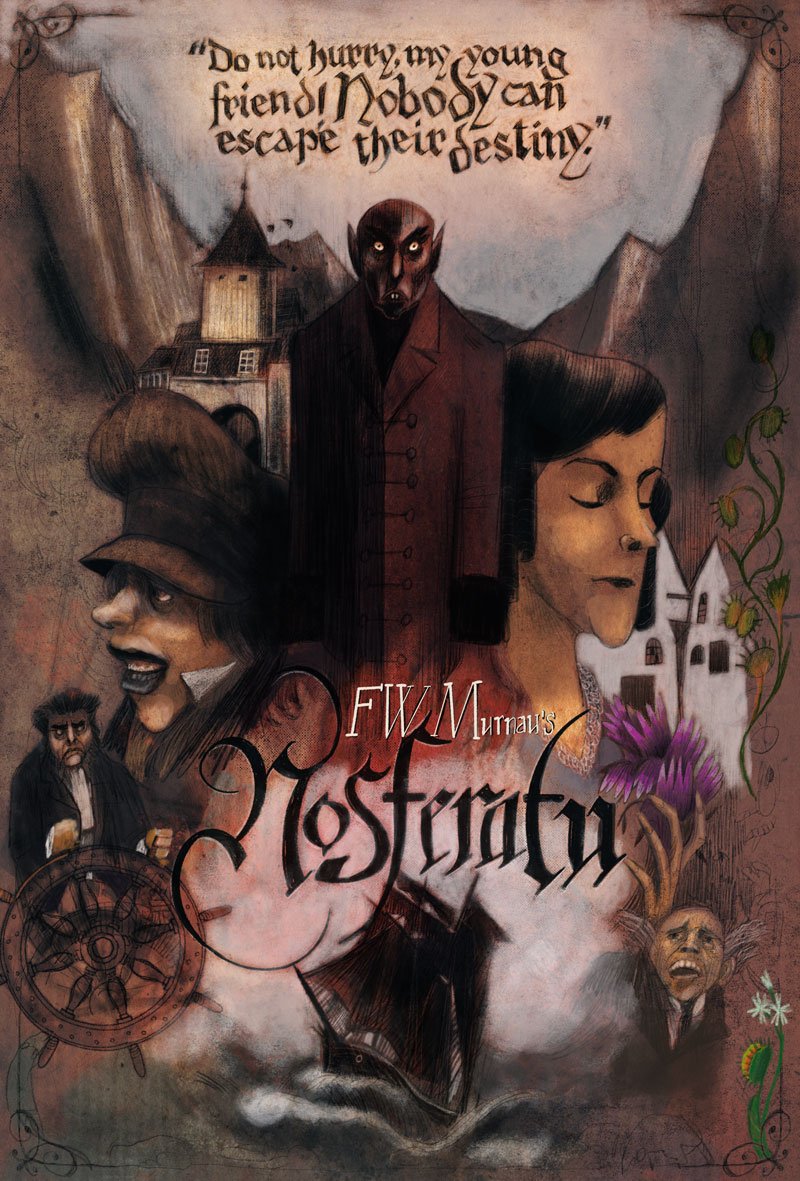
So I decided to watch Nosferatu once more... But this time, I was looking for a theme, something that would overarch the whole movie transcending the characters or the locations.
The answer would come by the hand of Professor Bulwer (van Helsing in Bram Stoker's original book) when he is describing the behaviour of venus flytraps towards the insects they hunt. From this perspective, everything in the film seems to become a metaphor for life, ultimately asking the biggest questions there are.
I finally had the finger on the pulse of what makes this film such an important one for me. With its aesthetic choices obviously flowing from the conceptual ones.
Once I had a theme, I rewatched it one more time looking for those undertones. I was amazed to find so much more stuff that previously had gone undetected. Flowers and insects are some of the threads that are constant on the film wether in the foreground or just as a patterned decorative wallpaper in a set.
As I started developing these ideas, the poster became more and more interesting.
When I was finished, I knew I had arrived at something special.
And here you have it. I hope you like it as much as I do.
